Oasis / POM Advertisements
 Oasis Advertisement
Oasis presents a realistic and cynical view of advertising, while still using traditional advertising tactics.
This poster tells the viewer basic facts (This advertisement was ran in the summer). It tells the user quite frankly that they have to sell a certain amount of bottles of Oasis. With this, they are not being deceptive (seemingly) because they are poking fun at the advertising industry by being so blunt with their marketing. I think that this is effective because there is supposedly no deeper meaning or symbolic code behind this advert - on the surface. Many people who feel that they are too smart to be fooled by advertisements may fool for this one based on the fact that it appears to nudge the viewer and say 'Hey, we aren't like other brands with their deceptive marketing' where in actual fact, if a consumer buys a product because of this advert then they are still buying the product, which is what Oasis wants.
 This poster is also laid out in a way similar to many other adverts of the same kind, such as Orangina, the only difference being the text in the middle. This acts as a parody for other juice drink adverts, and as seen in one other their other advertisements - the poster is essentially the same, the only difference being a slight variation on the splash and the text being different. This is saying that 'It's basically the same product. You'll buy it regardless so why should we change the advert?' This type of advert is effective because it shows no difference to other advertisements of the same time, again Orangina. This advert is specifically designed to be generic in order to attract attention of people who would usually dismiss it as 'just another advert'. In actuality, I think that this advert acts as a very strong cynical parody advert and it is effective because of this.
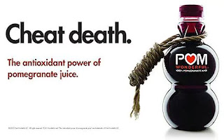
POM Pomegranate Juice Advertisement
This advertisement for POM pomegranate juice is misleading, but still bold. We live in an age where everyone is always on new diets or 'get fit quick' schemes, so it is no surprise that having a title such as "Cheat death." will draw a lot of attraction, considering that it could be considered something that is very sought after. Outright saying that you could cheat death if you drink this pomegranate juice is obviously a lie, but by the time you've seen the bold title, you've seen the noose tied around the bottle of said juice (something that on its own is incredibly controversial), you have also seen the logo, cleverly placed right under the neck of the noose. The advert uses common connotations in order to show the similarities in the words 'death' and the black image of the bottle as well as the noose, this gives the viewer a dark and terrifying image in their mind, and all of a sudden, a way to cheat this untimely demise seems even more appealing. This is where I feel that the advertisement is clever, as it has an incredibly subtle way of persuading the consumer to buy their product. This subtlety even extends to the choice of colour, the black in the bottle and text directly (as well as its themes) directly juxtapose the white background. White is often associated with purity and heaven, meaning that the death and destruction of life seen within the darker side of the advert is directly contrasted with a pure and heavenly mood which is given off by the background colour.


Comments
Post a Comment